japan travel brochure
The project was to create a brochure type product that would be used for promotion of a certain topic. Project showcases vector creation, and layout design, and theming for common print projects.
skills
- graphic design
- layout design
technologies
- adobe illustrator
brainstorming
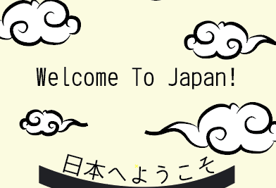
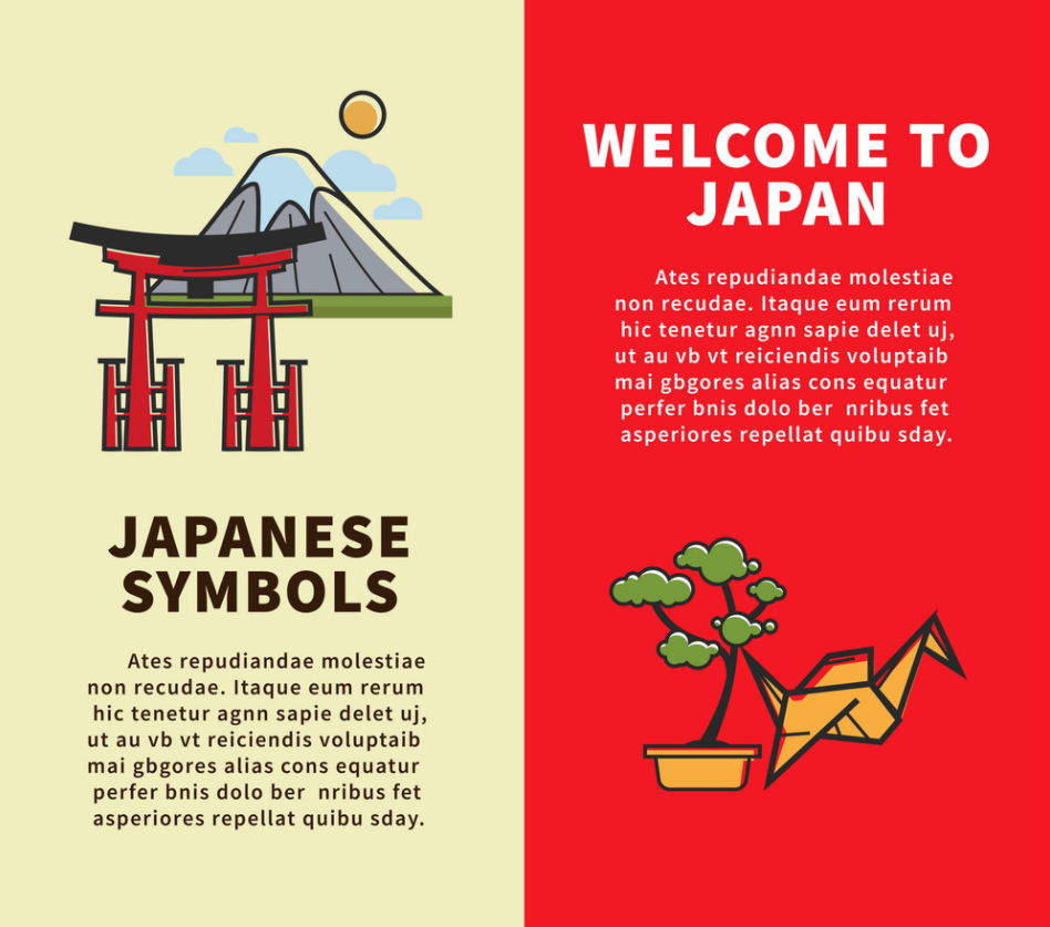
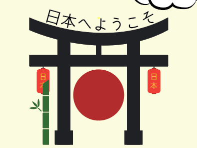
Referenced various Japanese themed prints for ideas for themes, and layout types. Decided to use a central image with a torii gate as the main image as it is a well-recognized Japanese structure.
asset creation
Spent time drawing out images to ensure they looked whole, and the dimensionality was logical. Also decided to add in bamboo, clouds, paper lanterns and a red circle. Red circle was added to represent the Japanese flag. The bamboo and paper lanterns added for aesthetic purposes and to provide a theme for use in the second side. The clouds were drawn in an older style Japanese art style and used to create a “box” of sorts to hold the text. On the second side, a brown line was drawn as a pole to hold the paper lanterns.
layout design
The text was placed in the upper center and made large to capture attention. Placed in the center of the clouds to give it a subtle box to be held in. At the bottom of the page the torii gate and other elements were added as the main image to support the above text. On the second side, the poles with the paper lanterns were used to hold the informational text.